Today we approach the third element in art. Texture. First I want you to consider doing an exercise. Take a sheet of blank white typing paper and a pencil. Walk about your home and if you have no snow, outside too, and begin by laying the sheet of paper on various textures, rubbing the side of the pencil on the sheet of paper laid over an area your eye sees as texture. You will find some amazing results! Here is a sheet of eight that I did the other day myself.

Consider some of the textures on your paper. Are there any there that really didn’t show up like you thought they might? Carpeting, a lampshade, something? You can see it, you can feel it, but now why do those that appear to have texture not show up in your rubbing? It’s the light! How the light hits an object helps to define that texture. It is how textures transfer to a two dimensional surface. To reproduce texture on a two dimensional surface requires manipulation of light and value. We can feel it, touch it but can only see it because of light. You’ve heard of the “golden hours” in photography it’s not just the color the light emits but also consider the texture and definition from light to be one of the reasons as well.


Take these two photographs from Fiji. It is the same water, intangible on paper, yet the light has made for two very different “feelings” within them. The calm water of the morning light in one leads to a feeling of a peaceful morning and the tide water arriving in ripples as the sun sets adds more dynamics to the second. While color plays a role in what the photographs evoke, so does the texture of the water. They both provide an overwhelming sense of feeling within the photograph and evoke very different emotions.
Animals are also a great example of how texture plays a role in photography. This photograph of a koala, up close with its well defined fur makes it seems so soft, luscious and thick. It definitely helps portray the notion of how soft and cuddly they might be contrary to their actual needs and demeanor. They cannot be handled very much or long in any given day, yet this photograph makes you want to take and cuddle it all day long all because of the texture the photograph presents of its fur!

Now look at this crocodile! It you weren’t apprehensive about it before you might be after looking at this photograph. The eyes and the texture of the skin definitely lead you to a cold, detached feel. You certainly would not want to cuddle with that croc all day long!
One more set of photographs to look at in regard to considering texture are of people. Look at the photograph of this young girl, smooth skin, soft and supple definitely shows her youth and innocence. Now consider the role texture places in signifying age in a portrait. Look at the second photograph of this cormorant fisherman and the texture in their face shows a life well-spoken and defined and adds to the interest of the photograph making you want to know more about them.

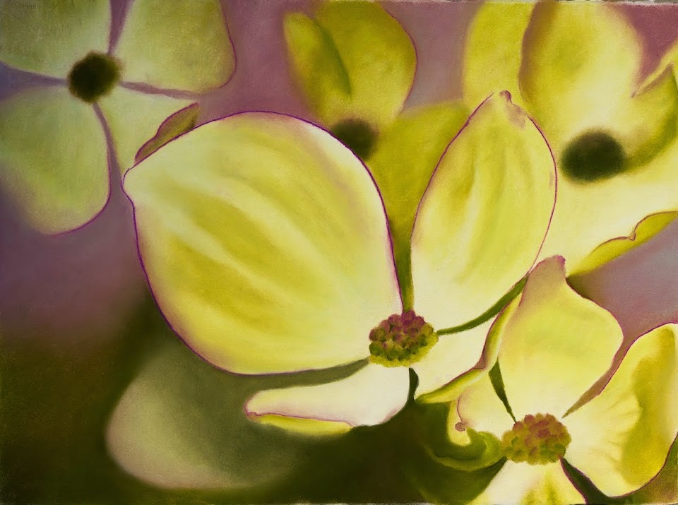
Texture can be emphasized as a way to generate a certain feeling in your photography. It does not need to be simply of animals although it is a universal way for me to explain it. You can find it in nature as well, stone, grass, wood, dirt, the clouds. Everything really has texture or the absence thereof. In other words the "absence" of texture can be just as important or interesting in simplifying a subject as much as a splash of texture does to add contrast. I think of Lightroom, where you can add or take away clarity where it manipulates the mid-tone contrasts in a photograph. Use this tool to help define what you want people to “feel” in your work and portfolio.
It reminds me of grunge or some street photography where you can even find they have added an overlay to produce a specific “feel” to their work. Video games and much of their visual marketing use this method as well.
I hope you begin to think about what a specific texture might invoke in your feelings, how it creates a mood or defines a particular type of work. How it defines your work. Begin to think about all three of these elements together, line, shape and texture. How will you use them to convey what you have brought to your photographs and what you might desire to be known to bring to your work? What do each of these things bring to the overall essence of your work? How do your photographs or a body of work emulate you?
Keep your eye out for textures this week and see what you can find, what you can take a photograph of and how you might use it to your best advantage in defining your photographic vision and portfolio.
Texture albums are posted at both
Flickr and
Facebook.


 The element of art called value. Value means exposure variance, the darks, lights and mediums of art or in a photograph. This can more easily be seen when a photo or drawing is produced in black and white. The depth of shadow and the height of highlights are on either ends of the idea of value. A histogram is valuable for determining the overall tonal quality of a photograph. If the curve leans to one direction or another it shows the overall value of the photograph. One of the best ways to see value in a photograph or picture can be to squint or blur it to see what it looks like without definition. In essence it is a way to see the compositional arrangement and where the eye is brought to in the photograph or picture because the lights will always draw your eye to them. Rembrandt, though a very realistic painter, was magical at this as the painter of light. If you blur any of his paintings you can see what I mean, he was abstract in a very realistic way just by the way he used lights and darks in his work. Value can REALLY make a piece of art good. Without value a piece of work is without definition. Sometimes using one tonal quality is valuable in conveying certain moods, but you have to realize the impact of value before you remove it to be on only one tonal level and understand what it does for your work.
 Consider this pair of photographs, one in color, the other transformed to black and white yet the mood stays the same because it is not just the color but the value in the photograph that creates the pleasant mood.

 Take these two photographs from Fiji. It is the same water, intangible on paper, yet the light has made for two very different “feelings” within them. The calm water of the morning light in one leads to a feeling of a peaceful morning and the tide water arriving in ripples as the sun sets adds more dynamics to the second. While color plays a role in what the photographs evoke, so does the texture of the water. They both provide an overwhelming sense of feeling within the photograph and evoke very different emotions.


 Here also notice a simile of sorts where you have a rectangle, triangle, circle, skewed rectangle, and then finally a triangle. If the eyes don’t “grab” your attention the placement of the oval in the photograph will. Here is an example of a more angular and square face.
 We can see where shape/s might be repeated; even though they are different objects the shapes contained in them may be the same---and don’t forget the “negative space!” You can see how shape will come into play in the principle of balance. Consider these photographs from nature and the shapes found within them. Notice on the sunflower photograph called “Flaming” we have the idea of a circle, even though it is not fully visible contributing to the abstract feel of this photograph.